Generate Violin Plot from Population Averages
Introduction to Violin Plots
Have you ever wondered how to better understand data distributions? A violin plot might be just what you need! Violin plots are a fantastic tool in statistics that help you visualize the distribution of your data, showing you more than a traditional plot would. Imagine being able to see the full spread of your data, including where most of your data points lie, all in one neat graph.
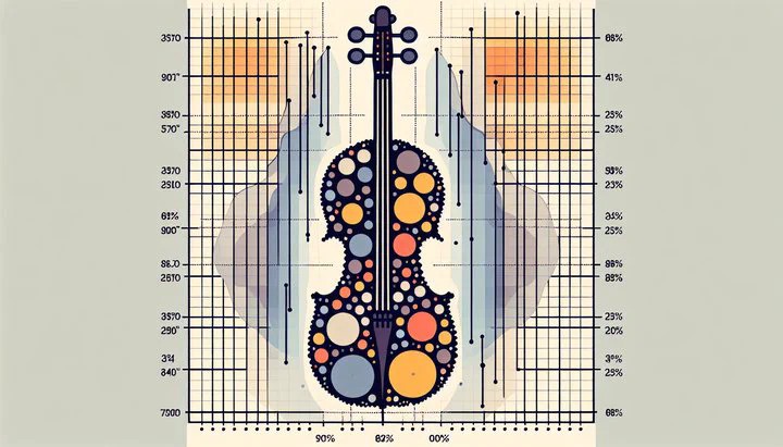
A violin plot looks a lot like a combination of a box plot and a density plot. It includes the kernel density estimation, which is a way of smoothing your data, helping you see the overall shape of the distribution. This makes it easier to spot patterns or anomalies. The plot itself resembles a violin (hence the name), with a body that shows the density of the data at different levels.
Compared to box plots, which only show quartiles and medians, violin plots give you a full picture of the data distribution. While histograms can also show data distribution, they don’t provide the same level of detail about the density of data points. Violin plots are especially useful when you want to compare different groups—like controls and mutants—by visualizing how their distributions differ.
Using violin plots can be particularly powerful when you’re working with complex datasets. They let you see both the central tendency and the variability of the data, which is crucial for accurate analysis. By learning to generate a violin plot from population averages, you’ll gain insights that might be missed with other plot types. This makes violin plots an invaluable tool in your statistical analysis and data visualization toolkit.
Using Population Averages for Controls and Mutants
When analyzing datasets, you might come across terms like population averages. But what exactly does this mean? In simple terms, a population average is the average value of a specific measurement taken from a group of subjects. For example, if you’re studying a group of plants, the population average might be the average height of those plants.
In statistical analysis, comparing the population average for controls and for mutants can be very insightful. Controls are typically the standard or normal group, while mutants are the group that has undergone some change or treatment. By looking at these averages, you can start to understand how the treatment or change impacts your subjects. For instance, if you’re studying genetic mutations in cells, you might calculate the average number of abnormal cells in both the control group and the mutant group.
To calculate these averages, you simply add up the measurements for each group and divide by the number of subjects in each group. Let’s say you have a dataset of cell counts, and you want to compare the number of abnormal cells in controls versus mutants. You would calculate the average number of abnormal cells for each group separately. This allows you to analyze these averages to find the population average for each group.
These comparisons can reveal significant insights. For example, if the population average of abnormal cells is higher in mutants than in controls, it suggests that the mutation might be causing more cells to behave abnormally. By learning to generate a violin plot from population averages, you can visually compare these averages and see the distribution of your data.
When you visualize the data using a violin chart for this dataset, you can see not just the averages, but how spread out the data is, and where most of the data points lie. This is particularly useful for understanding the percent of cells that were abnormal in each group, giving you a deeper understanding of the effects of mutations compared to the control group.
Creating a Violin Plot with Real-World Data
Ready to bring your data to life with a violin plot? In this section, we’ll walk through how to generate a violin plot from population averages using a real-world dataset. This will help you understand the distribution of data, especially the percent of cells that were abnormal in the dataset.
Let’s start by using a dataset that includes information on both control and mutant groups. Imagine you’re working with data that measures cell counts, and you’re interested in the number of abnormal cells in each group. First, calculate the population average for controls and for mutants by adding up the cell counts in each group and dividing by the number of samples. This gives you a clear picture of the central tendency, which is crucial for your analysis.
Now, let’s generate a violin plot using a programming language like R or Python. You can use libraries such as ggplot2 in R or seaborn in Python to create the plot. These tools make it easy to visualize complex datasets. Import your data, and then use the following steps to create the plot:
- Load your dataset: Make sure your data is clean and organized.
- Calculate averages: Compute the population averages for the control and mutant groups.
- Create the plot: Use the appropriate functions in your statistical software to draw the violin plot.
- Customize the plot: Add labels, change colors, and adjust the scale to make your plot clear and informative.
Once your plot is ready, it’s time to interpret it. Look at how the data is distributed. The width of the violin at any point represents the density of the data. You can see where most of the data points lie and how they compare between the control and mutant groups. This visualization allows you to easily spot differences and patterns, making it a powerful tool to analyze the data.
Be mindful of potential pitfalls. Ensure your data is well-prepared before plotting, as outliers or missing values can skew the insights. By carefully preparing your dataset and accurately generating the plot, you’ll be able to see clearly how the percent of cells that were abnormal varies between groups.
By mastering how to generate a violin plot from population averages, you empower yourself to uncover deeper insights in your data. This skill is invaluable for anyone diving into statistical analysis or data visualization, and it equips you to make evidence-based conclusions with confidence.